Early this year I was commissioned to create some series illustration by friend Kelvin Co for The Oaks Fellowship. Kelvin wanted the artwork to be inspired by the "Wizard Of Oz" with my own interpretation. I'm really happy how it turned out.
Below is the trailer their team created for this series.
This project started back in early October. It’s been a while since I’ve been able to spend this much time on a piece. Three months might not be that long to some, but for a guy who’s used to turning several projects on a weekly basis, three months is an eternity.
In November, I reached a point where I felt this project was complete. I believe it was more me trying to shelve it due to already spending a month on it. This is the beauty of personal projects, one can decide when it’s finished.
The illustration is inspired by the last super of Christ, but more specifically the verse in 1 Corinthians 11:24, where He says "this is my Body which is broken for you."
This technique was heavily inspired by some of the geometric design that I've seen on the intrawebs and dribbble, but most heavily influenced by the work from http://www.dkngstudios.com/ , those guys are killing it.
Below are some screen shots taken throughout the process.
I've made the this series art avilable for download on CreationSwap.com here: http://cl.ly/DnI5
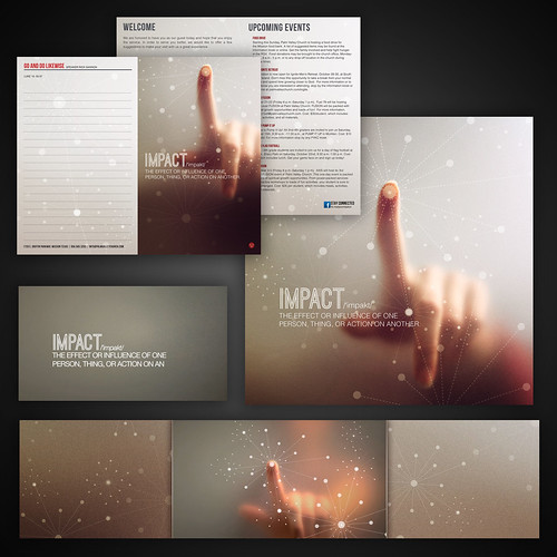
This past weekend we launched a new sermon series at PVC. The series is primarily based on the idea of the positive impact we should have and how those experiences connect to others.
The design itself was pretty simple, a image with some vector connection orbs and a bit curves color toning. The haziness of the image and how it focused not on the person but the action of touching something is what I wanted to communicate.
Once the artwork was approved the idea of making it into a bumper video came up. This was a challenge our team quickly jumped on.
The frosted galss look was accomplished by sitcking a window treatment film, we purchased at Home Depot for $20, over a normal piece of plexiglass. The rest was editing magic by my brother Oz.
Its always a productive week when you can start Monday with a blank slate and leave home Friday, having finished two series brands and a video bumper. Huge props to our team for helping pull that all off.
This first one is a series call "Peeled" that our teaching pastor Jerell Jobe started this past Wednesday. We had just finished a long series that started Ash Wednesday and lead up to Easter. I wanted to create something different and fresh.
It was Tuesday morning and I still had a blank canvas. That's when Mitch approached me and ask if he could offer some inspiration help. That was golden. He came up with the ideal about using an orange peel. From there I weighed a couple of options. At first I thought about using different fruit textures and making the lettering peel. Another idea was to use a different fruit for each week. I finally decided to just buy a couple of oranges and experiment with some photos. The $4 on oranges was not only cheaper then hitting up istockphoto.com it was also tastier.
After taking the photos it all came together quickly, by the end of the day, the artwork was approved and all the collateral pieces were made.
The second project was one we started talking about a couple of weeks back. The series "Courageous Living" is based on the book of Habakuk. The series is covering different aspect of courage in everyday life. The video idea came from wanting to show ordinary people, doing what they do, but having something that would symbolize that they are living courageous. We defiantly didn't want to go the SUPERHERO route, or anything over the top. We thought of people wearing a cape in ordinary situations. Thanks to our in-house seamstress, Cierra, she was able to create a couple options for our video shoots.
The print design was heavily influence by the video shoot. I just used some photos of the cape and carried those over to screen and print graphics.
I'm very please how both these projects turned out. Especially after sitting here and thinking these were both created in a weeks time.
This also shows that sometimes the best solutions is the simplest ones. A strong image with a nice typeface can go a long way.
Sermon branding has to be the favorite part of what I do here at PVC. I love the whole process from sitting in sermon planning meetings to designing concepts and then seeing all the pieces come together at the end. These my top five favorite sermon series graphics of 2010.
Regeneration: Was the first series of 2010.
Perspectives of Jesus: This was a fun one to design. The series was based on the different images and how they represented Christ. You can check out some of the original images I used to create the graphic here.
Going Places: I'm always up for the challenge of pulling off faux 3D using Illustrator and photoshop.
Faith & Luck: This was my favorite of the year. I love how the branding extended beyond print and ended up with a pretty crazy stage set. You can check out that set here.
Contagious Christianity: I really like the simplicity of the look for this series. Check out the sermon bumper my brother Oz created for it here.
Three days before leaving on vacation I found out that we were going to change directions on a series that was starting that weekend.
Since I only had a couple of hours to turn this project around I went with a simple stock image, some color treatment and plain text.
They liked the art so much the next questions was, "Can we make that into a video." Being short on time we starting looking at stock video options. Most of them range from $75-$300 and weren't exactly what we were looking for.
Instead, I went and pickuped a box of matches from the dollar store, and the rest was tv magic. We first tried stacking the matches side to side but found that it would burn too quickly. We used the opposite ends of the matches as spacers to give a even gap between the matches. This help slowing down the burning affect.
I really liked how the finished piece turned out, proves that design doesn't always have to be jaw dropping or overly complicated to effectively communicate. I'm really proud to work with a team that can come together to turnaround a project like this in a few days time.
Check out the finished bumper video below.
On another note, the music came from a new resources we found out about, audiojungle.net. They have a wide selection of tracks and reasonably priced.