A few weeks back we launched our fall groups. These groups included everything from financial classes to flag football. Instead of trying to promo each group independently we worked on pushing the idea of "life is better in groups."
We wanted these videos to be fun and playful. Huge props to the creative team and David, the actor, for making these videos a huge hit.
Three days before leaving on vacation I found out that we were going to change directions on a series that was starting that weekend.
Since I only had a couple of hours to turn this project around I went with a simple stock image, some color treatment and plain text.
They liked the art so much the next questions was, "Can we make that into a video." Being short on time we starting looking at stock video options. Most of them range from $75-$300 and weren't exactly what we were looking for.
Instead, I went and pickuped a box of matches from the dollar store, and the rest was tv magic. We first tried stacking the matches side to side but found that it would burn too quickly. We used the opposite ends of the matches as spacers to give a even gap between the matches. This help slowing down the burning affect.
I really liked how the finished piece turned out, proves that design doesn't always have to be jaw dropping or overly complicated to effectively communicate. I'm really proud to work with a team that can come together to turnaround a project like this in a few days time.
Check out the finished bumper video below.
On another note, the music came from a new resources we found out about, audiojungle.net. They have a wide selection of tracks and reasonably priced.
Summer has started and have to admit I really had some fun with the design of this series. From art, stage, to atmosphere around the building. I believe this has to be one of the best series we've launched coming from the production team. I'm blessed to work along side some talented individuals that help make this all happen. Below is a break down of some of the key elements.
THE ART
Once we decided on a carnival theme I new where I wanted to go with the artwork. The reasoning behind going with the carnival theme was that the sermon content was going to be pretty heavy and wanted the brand to give it a lighter feel to balance it all out. I drew inspiration from some old circus posters I found online. Below are some rough sketches I started with.
One extra element we did for this series is that I designed some posters that were posted all over the building to promote the new series. This was something we hadn't done in a while. It helped create some buzz leading up to the start of the series.
Here's a timelapse video of the making of faith & luck art.
THE WORSHIP GUIDE
We like changing up our worship guide layout. I came up with a long double sided guide. The finish size came out to 4.5x10.25. In order to use something with this length we ended up printing on cardstock to give it some stability. You can download a sample of our guide here.
THE INTRO VIDEO
Oz, my brother who also works here, animated the artwork to make a pretty sweet sermon bumper. This was played right before the speaker went up.
THE STAGE
The stage was a huge team effort to pull off. We were blessed to have a professional carpenter come in and volunteer his time to build the framing system for the center piece. We used our large format plotter to print off patterns that we glued down to the frame. Jorge, our stage design guru, really made it pop by adding textures and lighting. We also created a center logo piece, that gave a nice background during speaking IMAG.
I've been wanting to post this art for a while and was able to get to it today. AXIS, is our high school ministry here at the church. They came to me at the beginning of the year wanting to give their meeting room a face lift. We agreed on doing some wall art that had the key principles that they would be touching on through out the year.
Here's a little time-lapse of the making of it along with a short clip oh how it looks installed in the room.
One of the many things that I love about my job is the opportunity to work with the different departments at the church. Student ministries is something that is close to my heart and I try to help out as much as I can in helping them visually communicate to their specific audiences.
The project above is a mail-out piece I did for our high school ministry. The computer time it took to finish this project was longer then most, but totaled out to about a days work, not including tweaks and changes during the proofing process.
I really enjoy seeing projects go from concept to finish piece. My favorite part is always the actual design work but in order for that to go smoothly there are several things that most happen outside of the computer.
I remember meeting with the high school staff and listening to them tell me why they wanted this piece. There first idea was to do a calendar of some sorts to hand out. While this was a good idea, we began to think of the events that would be this calendar. Some of the events didn't hadn't even been finalized and would have to push production back. With further dialogue we agreed that we didn't want this to be content heavy.
By the end of the meeting we both narrowed down the goal of this project which was: to create a save the date mail-out that would be cool enough to hang on a student's refrigerator at home.
The other key ingredient to this was time. Normally we have a two week turnaround. Which by most standards isn't very long. This was a project that could have been done quickly but I'm thankful they gave me plenty of time to finish it.
The whole project from start to finish took almost two months. It's not like we work on it everyday but this help to give me the freedom to experiment with the layout and time to let it sit. For me, I feel I can push a project more if I'm able to walk away from it and come back to it later.
The end result was great, they were happy and so was I. The projects that get me are the ones that I have regrets about, the ones that I wish I could go back and tweak some lighting or another element. With this one as soon as It rolled off the printer I was content.
This has been a crazy week so far. I had about three days to layout a 64 page devotional booklet and get it to press. It was three days of copy-paste-format over and over again. The bright spot in this project was designing the cover. I have been wanting to try out, what I call, a word art style (not to be confused with word art in Microsoft word) for a while.
This devotional booklet is going along with the Lent series starting Ash Wednesday. The teaching pastor hook me up with forty key words he was using during this series. I had the idea in my head and really like how it played out. The time lapse below took three hours in real time.
I first have to give some props to my office-mates Marc, Cierra, & Oz. Wether it's video or print, here at PVC, chances are thier finger prints are on there somewhere. I'm really blessed to work with talented individuals that are always raising the bar.
This fall the video squad launched a new look for our 5-til video announcements. They've been working hard to continue the excellence and keeping it fresh. Here's video that was used a couple of weeks back.
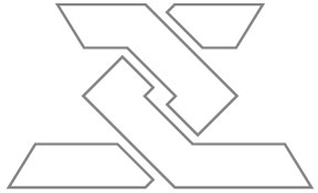
I created a new logo for our middle school student leaders group this week. The youth pastor liked the logo but ask if I could spice it up a bit. So I made this my "special" project. Total man hours was about 6 stretched out over 4 days.
If you look at the time-lapse video you can see I started one direction and ended up going another. Well, last night I couldn't sleep and I started thinking about this design and wondering how I could push it some more. I laid there photoshopping in me head until I fell asleep. Unfortunately all I could remember this morning was glass. I'm not %100 happy with the way the it turned, but sometimes you just have to move on.
It has been a very productive week here at PVC. I was able to spend some time working on a couple of projects for our student ministries. One of the things I enjoy the most about being a church creative is having the opportunity to work on projects with different audiences. It makes every week here exciting. One minute I'll be working on a men's retreat booklet and then next galaxy art for the High School department.
Here are a few projects I worked on this week for student ministries: